

In this topsy-turvy world we live in, disaster can strike at any moment.
It’s scary, but it’s not something that is fully outside of your control. When it comes to managing risk and reducing potential losses, staying up to date and using the right geospatial tools makes all the difference.
Why the right tools matter
Many insurers are not as proactive as they could be. Because natural disasters don’t play by the rules, managing risk saturations requires an up-to-date picture of emerging risk as it’s happening.
The 2018 Camp Fire in Northern California was a horrific disaster: not only were homes burned and lives lost, but a regional insurer was left in financial ruin. Unable to pay out millions owed to policyholders, Merced Property & Casualty Co. was forced into liquidation. What happened? The company had taken on too much risk in wildfire-prone areas ultimately ravaged by the Camp Fire.
 The best way to visualize evolving risk is to use the correct tools for the job.
Related:
How Real-Time Risk Concentration Analysis Empowers Insurers
While the fickle nature of natural disasters cannot be fully accounted for, a preemptive approach to risk saturation management can give companies the ability to make informed decisions. Had Merced Property & Casualty Co. utilized real-time geospatial risk concentration analysis, there is a chance they’d still be around today.
The old way
Traditional methods of concentration management, while time tested, are limited in their ability to stay up to date with changing conditions.
Insurers often rely on reinsurance reviews to uncover their risk saturation. These reviews can reveal high concentrations of risk, allowing insurers to pinpoint potential problems and take steps to rectify them. Choosing to either go without full reinsurance coverage or find another way to mitigate risk, such as not renewing policies, have long been sufficient methods of concentration management.
But what happens in between reinsurance reviews? What if an insurer accumulates too much risk in the interim? By the time a disaster strikes, these dangerous vulnerabilities can leave an insurer facing steep payouts, bankruptcy, or liquidation.
How can insurers stay on top of and visualize evolving risk? It’s all about having the correct tools for the job.
The new way
With the right tools, property insurers can efficiently and accurately understand their concentration of risk, giving them the ability to take action to address it before it becomes a problem.
Traditional methods of saturation management rely on spreadsheets – fantastic tools for assessing, measuring, and managing locational data. Though spreadsheets do an exceptional job recording locational data, such as addresses and latitude-longitude pairs, gleaning useful conclusions from this data can be a time-consuming process. Underwriters only have so much time in a day. Simply put, they don’t have time to analyze spreadsheets; they need quick, clear, and accurate data in order to make effective decisions.
The solution is to use easy and dynamic data-powered maps, giving you the ability to assess multiple types of natural disaster risk in a user-friendly interface. Our “mapplication” works like popular mapping apps, allowing you to visualize all the data from your book of business in real time. No extensive training is needed, giving you the opportunity to rapidly realize value.
 Though traditional methods may be steadfast and familiar, there is a new way.
Related:
Managing Concentration of Risk with the Power of Maps
Let’s explore some examples of how easy it is to visualize risk data using our tools. The following examples use wildfire risk to illustrate our geospatial capabilities. You can use similar methods to assess other types of natural disaster risks too.
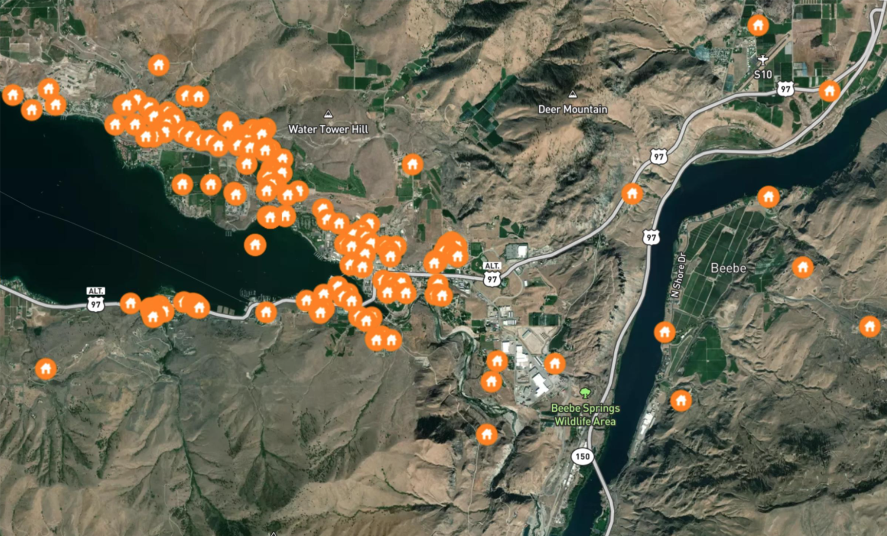
Welcome to Lake Chelan, Washington (above), a popular vacation destination and area prone to wildfires. Each of the orange houses indicated on the map represent one property insured by a hypothetical insurance company – they’ve loaded their book of business into the system.
Next, we are going to overlay past wildfire data, showing the perimeters of previous burns and allowing us to visualize the concentration of risk in the area.
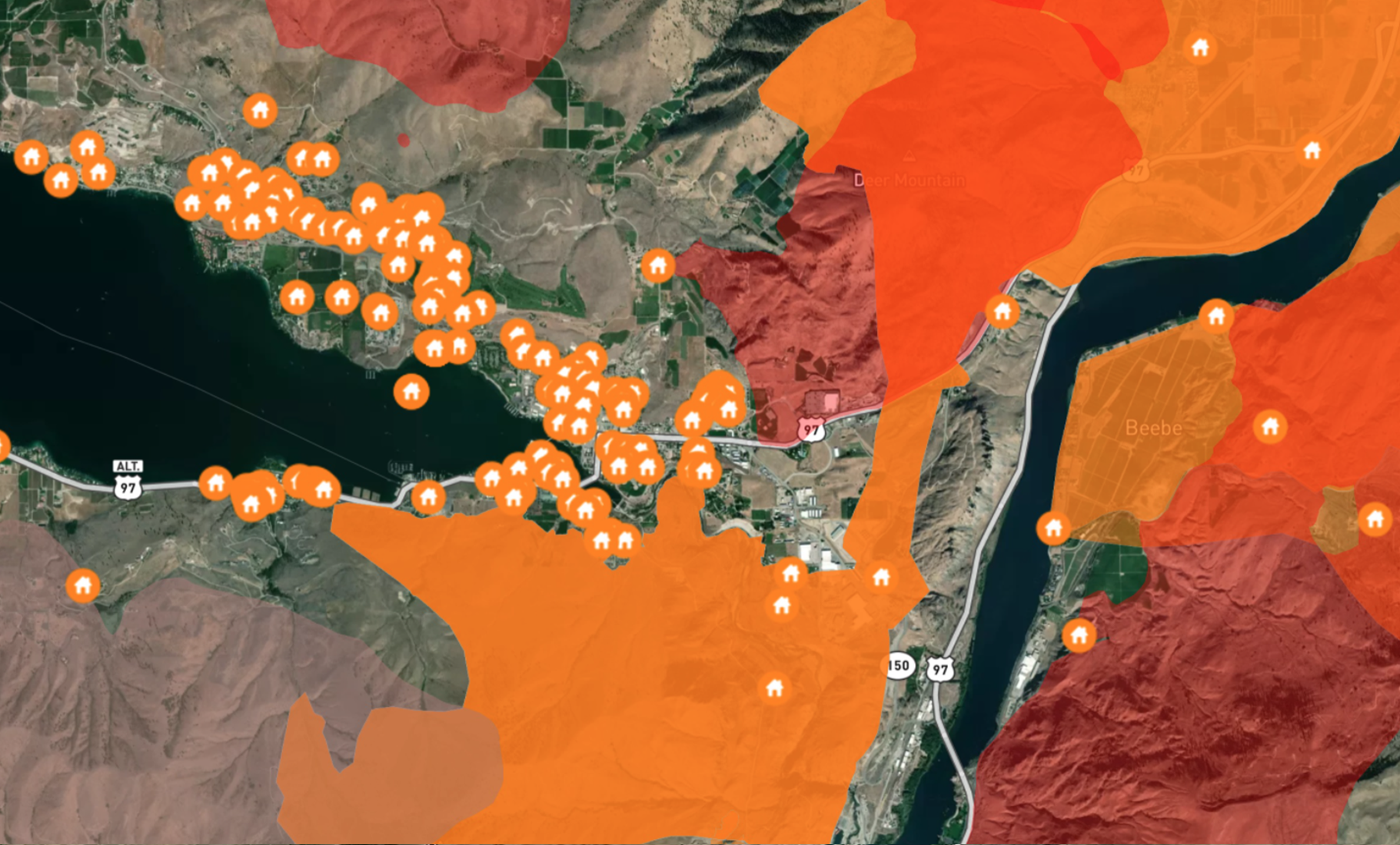
This map shows all existing data for wildfires in the region, showing fires from 1994 to
the present. As you can clearly see, any insurer taking on even a small portion of the properties in and around the Chelan area could face a consequential concentration of risk.
Let’s zoom out and see a greater picture of the total risk in the area.
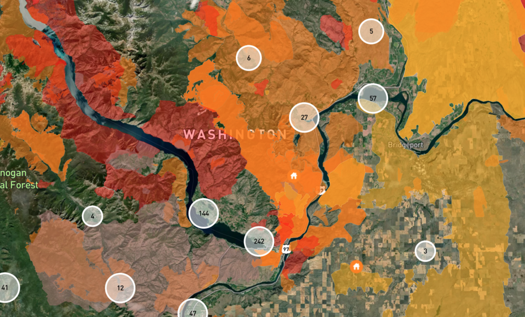
A map like this one gives underwriters the ability to clearly visualize the insurer’s concentration of risk all at once, seeing which fire-prone regions have the highest saturation. The circles represent the risks insured by the company.
In the next map, we will see how simple it is to determine the total insured value in any given area.
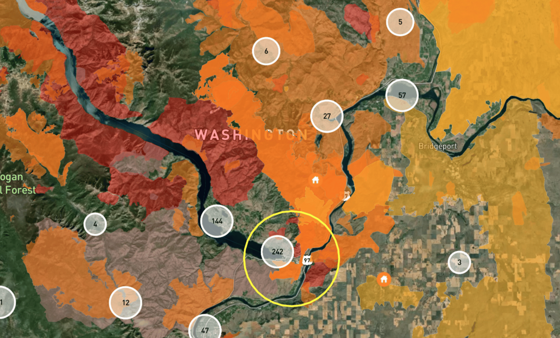
Within this hypothetical book of business, the area selected (the yellow circle seen here)
has a radius of five miles and contains over $91 million in overall insured value.
Conducting an assessment like this only takes a few clicks, allowing you to pinpoint specific areas for analysis.
The examples above illustrate how much easier it is to visualize risk geospatially in comparison with traditional spreadsheet-oriented methods. Being able to determine susceptible properties with ease, you can make informed decisions to better manage risk concentrations.
To learn more about the benefits of these tools, check out our blog post on the subject.
Want to learn more?
We’ve partnered with GIA Map to develop these tools. They’re dedicated to building geospatial products that help to improve risk selection, identify growth opportunities and reduce losses.
Want to determine what the right mapping application can do for your business? Contact us today to schedule a demo.